Pekerja VS Pengangguran
DI INDONESIA
This project contains data analysis from several datasets on unemployment and workers in Indonesia. Some of the data used in this analysis may have biases related to technical issues and the possibility of political interference behind it. Therefore, please understand that the results of this analysis are likely to be inaccurate, as I am aware that assumptions built upon other assumptions will lead to conclusions that deviate further from actual reality.
However, if you are willing to read this project further, let us continue. I sincerely thank you for taking the time to read this simple project.
The data to be used in this project contains many biases for several reasons:
Some of the data provided by BPS are backcast results. Backcasting itself is a method that only produces estimated values rather than actual data.
Even if the data is not a result of backcasting, it may still be inaccurate due to several technical issues. As is widely known and considered an open secret in Indonesia, survey respondents sometimes provide inaccurate information to influence the government into granting them aid.
One example of manipulation by some individuals is reporting that a family member is unemployed and still young. This is often done to qualify for financial assistance known as the "Prakerja" program.
Now that you are aware of these biases and limitations. With these considerations in mind, let's move on to the project and examine the data in more detail.
The purpose of this data analysis is to understand the movement of unemployment and employment rates.
So the main question is:
Is the number of workers in Indonesia increasing (which would be a good sign), or is it decreasing (which would be very bad)?
data -
After exploring the BPS (Badan Pusat Statistik) website, I obtained 12 types of data to support our analysis this time:
Employment and unemployment data.
Open unemployment data - by region.
Open unemployment data - by gender.
Open unemployment data - by education level.
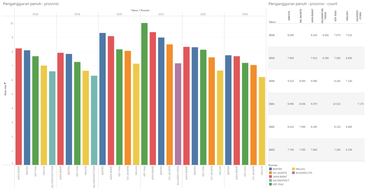
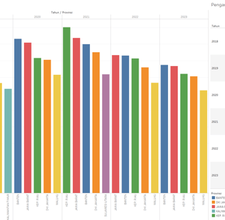
Open unemployment data - by province.
Open unemployment data - by age group.
Underemployment data - by region.
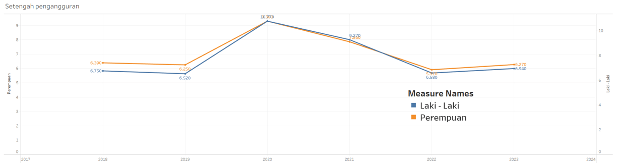
Underemployment data - by gender.
Underemployment data - by education level.
Underemployment data - by province.
Underemployment data - by age group.
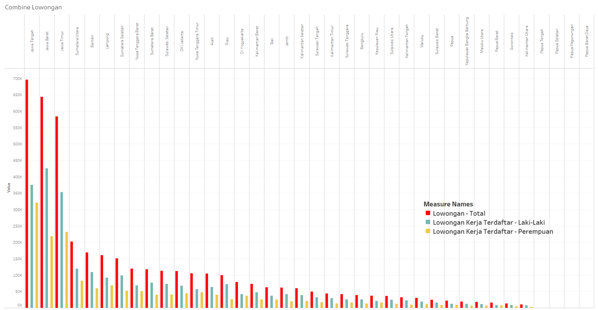
Core data - job vacancy fulfillment.
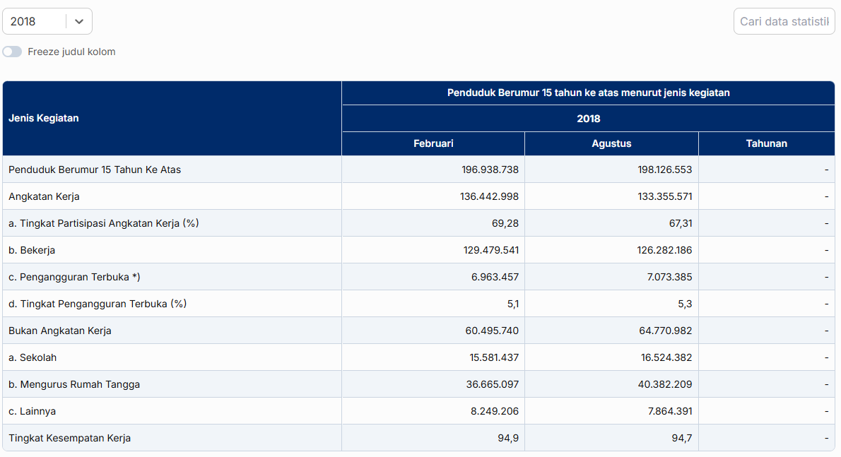
Employment and unemployment data -
This data contain data about number of employment and unemployment in Indonesia.
Categorize / status : employment, unemployment.
Year.
Time / month : February, Agust, Yearly.
Percentage.
Number (thousand).
Open unemployment data - by region
This data contain data about number of people that are not working at all and looking for a job - filtered by region they live in.
Categorize / status : city, village / town.
Year.
Percentage.
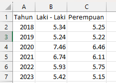
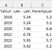
Open unemployment data - by gender
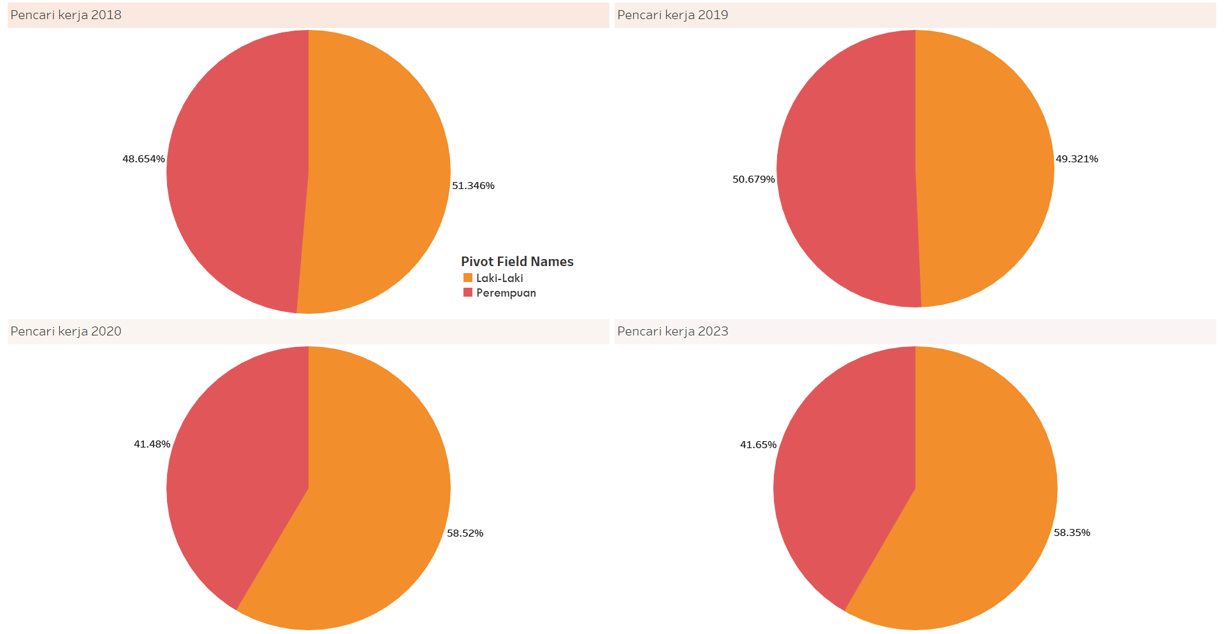
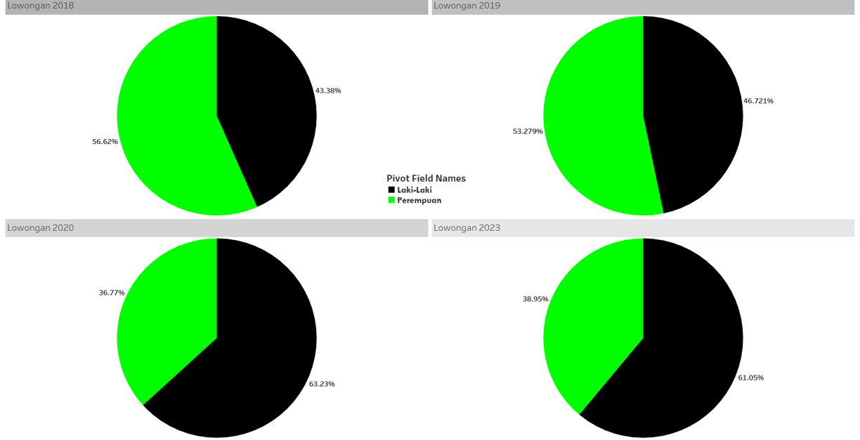
This data contain data about number of people that are not working at all and looking for a job - filtered by gender.
Categorize / status : male, female.
Year.
Percentage.
Open unemployment data - by education level
This data contain data about number of people that are not working at all and looking for a job - education level.
Categorize / status :
- Not attending school / not yet graduated, not graduated and graduated from elementary school.
- Junior high school.
- General high school.
- Vocational high school.
- Diploma 1/2/3.
- University.Year.
Percentage.
Open unemployment data - by province
This data contain data about number of people that are not working at all and looking for a job - filtered by province.
DATA CLEANING -
In this process, what is usually called data cleaning is more accurately referred to as data reorganization. This is because the data obtained from BPS is already clean. However, its format or structure may not be optimal for analysis, so some adjustments are necessary.
I will not explain each file one by one or detail every step of the reorganization process. Instead, I will outline a series of steps I take when encountering specific conditions in the data.
THE KEY STEPS ARE :
Remove data that is irrelevant to the information provided by the dataset
Select the data range, import it into Power Query, and apply transformations based on the predefined considerations as follows:


>>
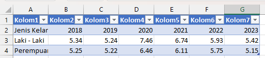
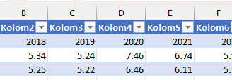
If the data is in the form of a pivot table, I will unpivot it.


rOTATE to unpivot
If unpivoting the data results in empty steps, I will fill them downward.


<<
If any headers become empty after restructuring, I will add appropriate labels.


Data modeling -
The data that i use for this analysis is comes from multiple seperate file. As an example : Employment and unemployment data is comes in 6 files. Each file contain about Employment and unemployment number thats wriiten in certain year. There is 6 file, means comes from 6 year. From 2018, 2019, 2020, 2021, 2022, and 2023.
Before proceeding to the data visualization step, it is best to first combine data from multiple files into their respective categories based on their relationships.
If a data category is better suited for the append rows method, then all files should be combined using this approach. Conversely, if a data category is better suited for the merge method, then merging should be applied accordingly.
Open unemployment data - by age
This data contain data about number of people that are not working at all and looking for a job - filtered by age.
Categorize / status : age scale.
Year.
Underemployment data - by region
This data contain data about number of people that are not working at full time or using their full skill - filtered by region.
UnderEmployment data - by gender
This data contain data about number of people that are not working at full time or using their full skill - filtered by gender.
Categorize / status : male, female.
Year.
Percentage.
UNDERemployment data - by education level
This data contain data about number of people that are not working at full time or using their full skill - filtered by education level.
Categorize / status :
- Not attending school / not yet graduated, not graduated and graduated from elementary school.
- Junior high school.
- General high school.
- Vocational high school.
- Diploma 1/2/3.
- University.Year.
Percentage.
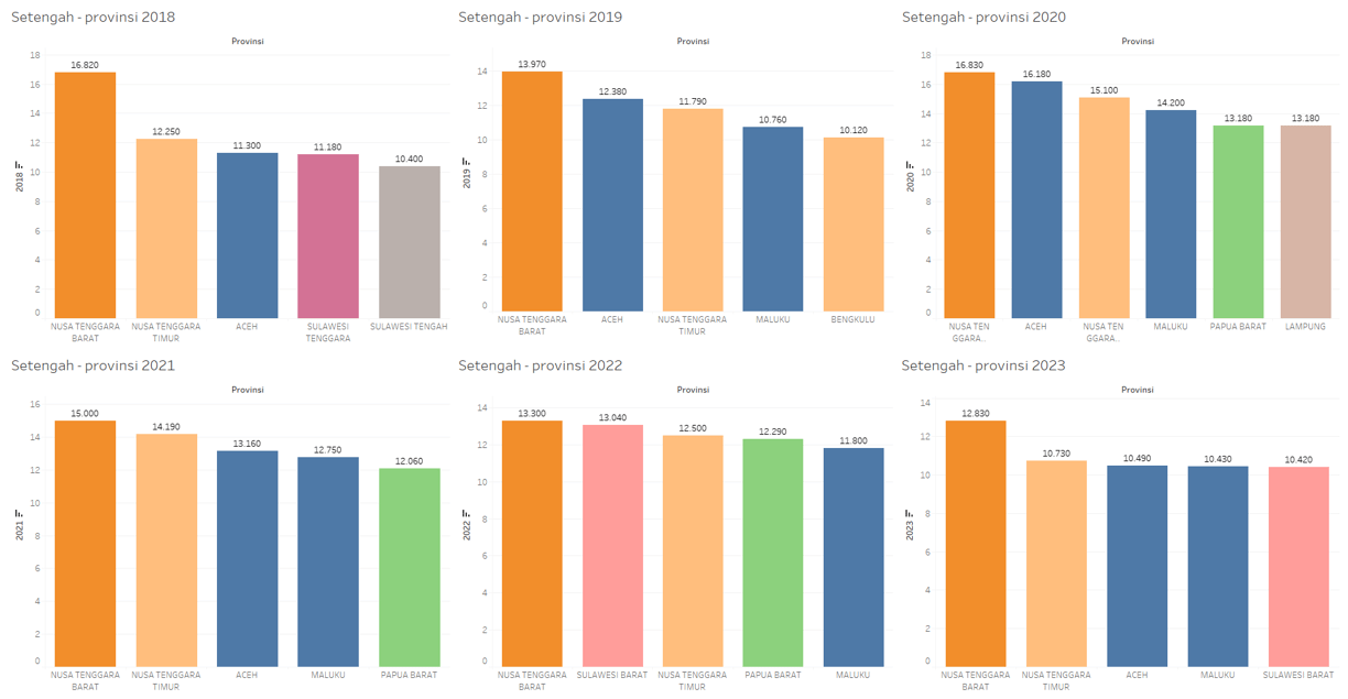
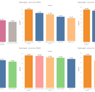
Underemployment data - by province
This data contain data about number of people that are not working at full time or using their full skill - filtered by province.
Categorize / status : province.
February
Agust
Categorize / status : province.
February
Agust
Underemployment data - by age
This data contain data about number of people that are not working at full time or using their full skill - filtered by age.
Categorize / status : age scale.
Year.
Categorize / status : city, village / town.
Year.
Percentage.
Regardless of the type or category of data being combined, the key point is that the data used in this analysis is time series data—whether it is monthly or yearly. The main focus of this analysis is to observe changes in a variable's values over a specific time interval.
Since the data to be analyzed consists of changes in a variable’s value over a specific time interval, the data merging method should also depend on how the data is presented over time. For example:
And just as I did in the data cleaning process, I will not explain each step in detail for every file. I believe the explanation above is sufficient to describe the steps I will take based on the situations mentioned and the considerations outlined. However, I will still present the final results.
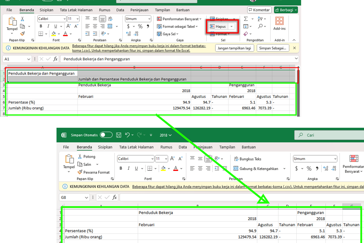
*I will use Power Query for all dataset merging processes. I will also remove all annual rows from any dataset because their content is "-", and I am unsure how to fill them appropriately. If I were to fill them with the average of data from February and August, I believe that would be unfair, considering that the average would be based on only two samples, while the total population in this context represents 12 months. Therefore, I have decided to remove the annual rows entirely


In the "by region" dataset, the time intervals are arranged across multiple columns (horizontally), such as Column 2018, Column 2019, and so on. Therefore, the most suitable merging method is merge, using the matching rows of the region column as the key.
In the second example, the "Employment and unemployment" dataset is structured vertically, with a column that records the year for each row. This means the time intervals are arranged vertically. Therefore, the recommended merging method is Append, combining rows from other files accordingly.
However, in the main dataset, the case is slightly different. This dataset does not contain columns with time interval data arranged in rows, nor does it have a column explicitly indicating the time interval for each row. Therefore, an additional preprocessing step is required.
First, add a Year column (since each file represents a specific year). For example, in the 2018 file, fill the Year column with 2018 for all rows, and do the same for other files accordingly.
Once this step is completed, the data can then be merged using the Append method.
ASKING -
In general data analysis, or more precisely, typically, the process of asking the right questions is placed at the beginning of the data analysis workflow. However, in our project this time, the questioning phase comes after the data has been cleaned. Why? Because the data source in this project is relatively incomplete. Therefore, I have determined that the process used in this data analysis will be slightly different.
In this case, the process of "asking questions" in data analysis is better approached by posing the core questions first, followed by technical and detailed questions later, after all the data has been cleaned and gathered.
With this workflow, I believe the core questions are answered first, while technical and detailed questions can follow later. I think this approach is reasonable and well-accepted.
The core question is: "Has the trend of unemployment rates in Indonesia over time been getting better (meaning the unemployment rate is decreasing) or getting worse (meaning it is increasing)?"
Considering the main question, which aims to identify data trends, and the data obtained from BSI, the following questions are worth considering:
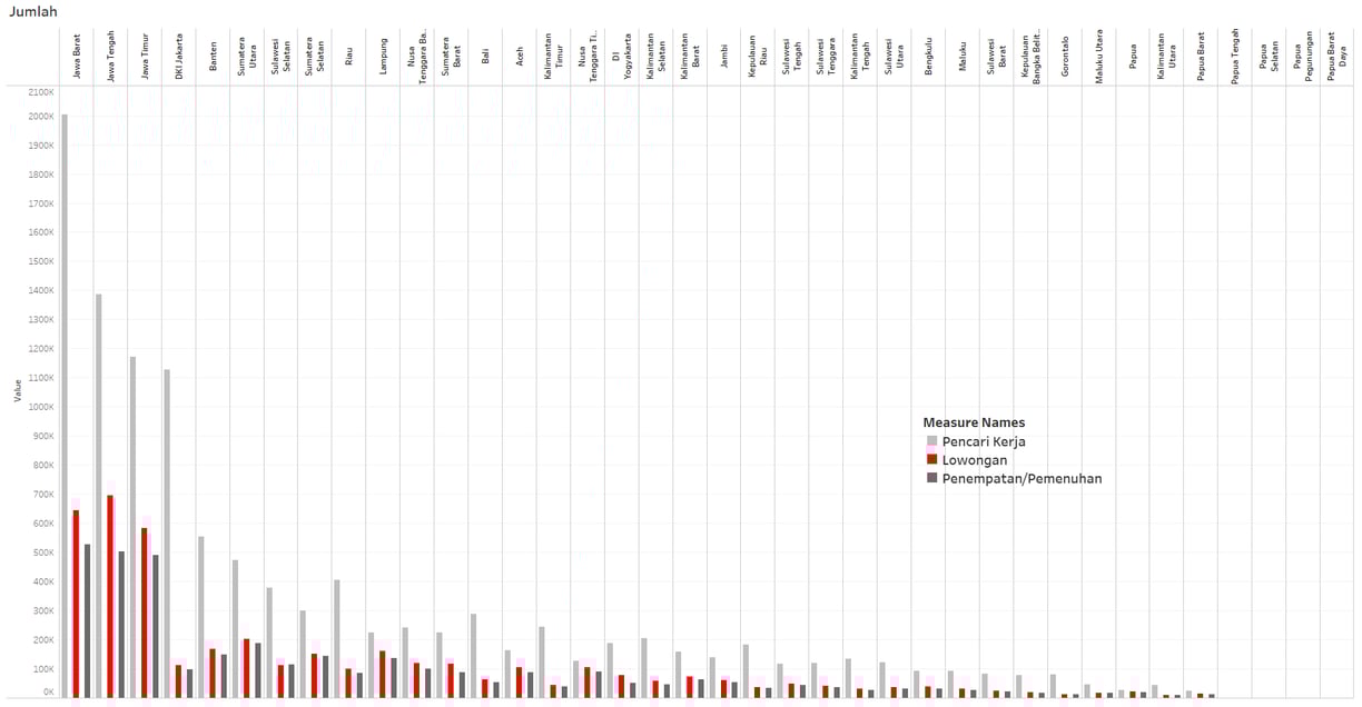
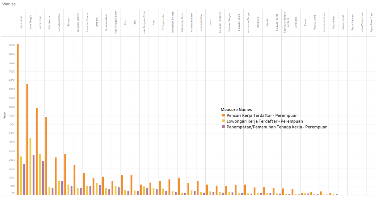
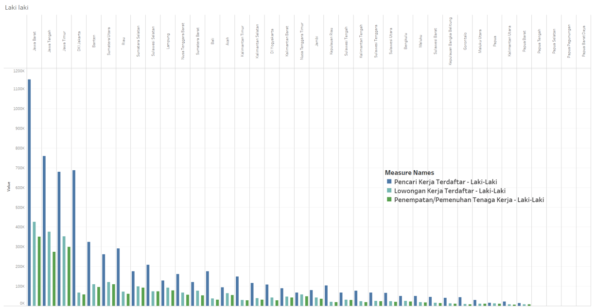
Is job fulfillment in Indonesia effective?
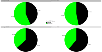
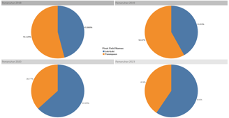
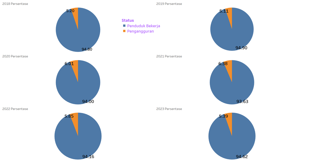
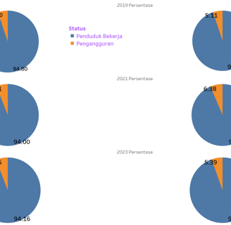
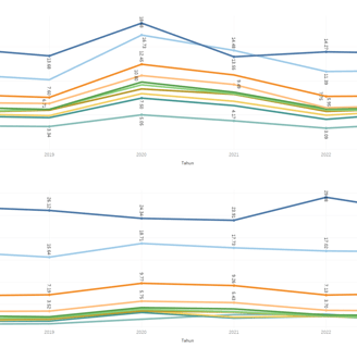
The development of unemployment rates vs. workers over time.
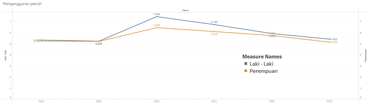
Over time, which gender has more unemployed individuals, male or female?
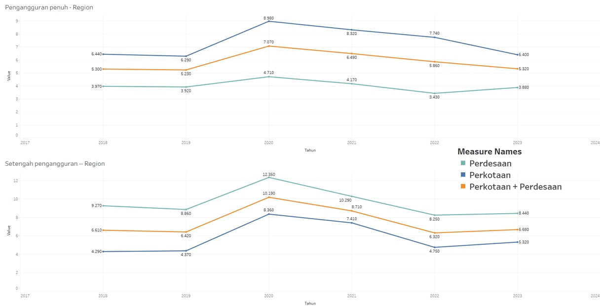
Over time, is unemployment rising more in rural areas or increasing more in urban areas?
Is the development of unemployment data always relevant to a person's level of education?
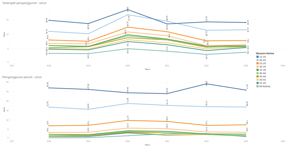
Do young workers contribute more to the unemployment rate, or is it the older ones?
Are the top provinces with the highest unemployment rates always occupied by the same or similar provinces, or do they vary over time?